What I Would Build: A Multi-Tenant Portal for PE Technology Oversight
What would a purpose-built technology oversight portal for PE operating partners look like? Here is how I would approach it — the architecture, the trade-offs, and the decisions that matter.
Every PE operating partner I talk to has the same problem: no single view of technology health across the portfolio. Spreadsheets get stale. Quarterly updates lack depth. And nobody wants to log into 12 different dashboards.
So I have been thinking about what a purpose-built solution would look like. Not a generic BI tool, not a repurposed project management platform — something designed specifically for the PE technology oversight use case.
The Problem Worth Solving
After running the fractional CTO playbook across multiple portfolio companies, the gap becomes obvious. You generate assessments, roadmaps, and recommendations for each company — but there is no single place where the operating partner can see the full picture.
They want to know: Which companies have the highest tech debt? Where are the quick wins? Which roadmap items are on track and which are stalled? And they want it without scheduling a call.
How I Would Architect It
Multi-Tenancy as a First Principle
PE firms are paranoid about data isolation — rightly so. Portfolio companies are often competitors in adjacent markets. The architecture has to guarantee that Company A's data is never visible to Company B, even if both are in the same fund.
The natural approach is tenant-per-firm with Microsoft Entra ID handling identity. Each PE firm gets its own tenant. Portfolio companies are mapped within that tenant with role-based access. SSO, RBAC, and audit logging come for free instead of building them from scratch.
Row-level security at the database layer provides a second line of defense. Even if the application layer has a bug, the data layer enforces isolation independently.
The Data Model
The core entities are straightforward:
- Fund — the PE firm and its organizational structure
- Portfolio Company — each investment, with metadata about industry, size, hold period, and deal thesis
- Assessment — point-in-time snapshots (AI readiness scores, tech debt inventories, security posture)
- Recommendation — specific action items with status tracking, ownership, and expected impact
- Milestone — roadmap items tied to the value creation plan
The trick is making this flexible enough to accommodate different assessment frameworks without becoming a generic database. Every PE firm has slightly different priorities — some focus on security, some on cost optimization, some on growth enablement. The data model has to support all of these without becoming a spreadsheet.
Embedded Analytics vs. Building Your Own
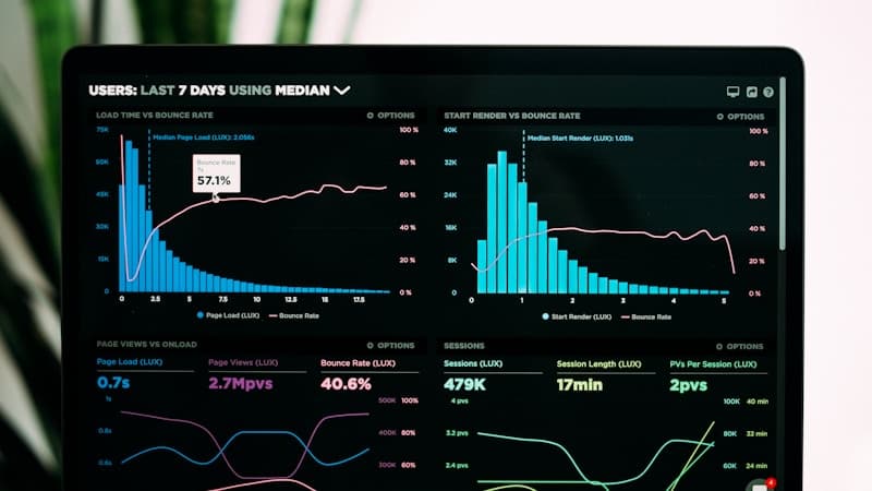
The temptation is to build custom dashboards. The pragmatic choice is to embed an existing analytics tool so you get visualization richness without the development overhead. Operating partners are used to looking at charts and heatmaps — give them something familiar rather than inventing a new visual language.
The key insight is: embed, do not redirect. The moment you send someone to a separate tool with a separate login, adoption drops. Everything has to live in one place.
What It Would Do
- Portfolio Health View — aggregate scores and metrics across all companies, with the ability to sort by risk, opportunity, or urgency
- Company Deep Dives — drill into any company for detailed assessments, recommendation status, and historical trends
- Engagement Tracking — which recommendations have been implemented, which are in progress, and which are blocked. This is where accountability lives.
- Board-Ready Reporting — exportable summaries that translate technology findings into business language. No jargon, no architecture diagrams — just outcomes and investment requirements.
The Decisions That Matter
Building a platform like this forces you to make trade-offs that reveal what you actually care about:
Build vs. buy the analytics layer? Buy. The differentiation is in the data model and the workflow, not the charting library.
How much customization per firm? Enough to accommodate different assessment frameworks, not so much that every deployment becomes a custom project. Configuration over customization.
Who enters the data? This is the hardest question. If it depends on manual data entry, it will go stale. The more you can automate — pulling from existing tools, integrating with cloud platforms, scraping license portals — the more reliable the picture.
How do you handle sensitive findings? Some assessment results are politically charged. A company scoring poorly on security is not just a data point — it is a conversation that needs to happen carefully. The platform needs to support nuanced access controls, not just binary show/hide.
The Real Friction Points
The technology is the easy part. The hard part is organizational:
Getting portfolio companies to participate. Nobody likes being assessed. The platform has to deliver value back to the company — not just extract data for the operating partner. If the CTO at a portfolio company sees their own tech debt clearly for the first time and gets actionable recommendations, they become an advocate. If they just feel surveilled, they resist.
Maintaining data freshness. A dashboard that shows last quarter's data is a spreadsheet with extra steps. The automation layer — pulling license counts, cloud spend, security scan results, and deployment metrics directly from the platforms — is where the real engineering effort lives. Manual data entry is the enemy.
Translating across audiences. The same data needs to tell different stories. The operating partner wants portfolio-level heat maps. The board wants EBITDA impact. The portfolio company CTO wants specific recommendations. One data model, three different views, three different vocabularies.
Handling the politics of bad scores. When a company scores poorly on security or AI readiness, that finding has to be surfaced carefully. A raw number without context creates panic. Context without urgency creates complacency. The platform needs to support commentary, action plans, and progress tracking alongside the scores — not just red/yellow/green traffic lights.
What Exists Today
Most PE firms solve this problem with a combination of quarterly slide decks, shared drives full of Excel workbooks, and a lot of email. Some use generic project management tools. A few use BI platforms with custom dashboards.
None of these were designed for the specific workflow: assess → recommend → track → report → reassess. They all require manual translation between the assessment and the reporting, which is where information gets lost, delayed, or softened.
Why This Matters
The PE firms that have real-time visibility into portfolio technology health make better decisions — about where to invest, what to remediate, and when to escalate. The ones relying on quarterly slide decks are always reacting instead of anticipating.
Whether this becomes a product or stays a framework, the thinking behind it shapes how I approach every PE engagement. The question is always the same: how do we give the operating partner the visibility they need without creating reporting overhead that slows down the people doing the actual work?